I can’t believe it’s reveal day for Joe’s study. We have been working so hard to finish this on time, and we did it! This eight-week challenge turned into three weeks for us with grad school papers, work trips, kids’ sickness and all sorts of other great excuses. Now that it’s over, we may need a vacation.ha!
If you haven’t followed along and want to get caught up, you can find it all below.
Week 1 | Week 2 & 3 | Week 6

This was our original design for the back part of the room. As we developed the concept, we made revisions, but you can see that the original content remained consistent.
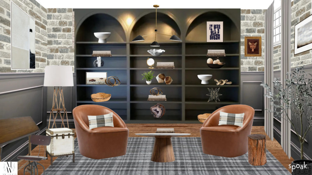
It’s always fun to look back at where this room was just a few short weeks ago. It was the last room in the house with the original color and received none of the additional touches that we’ve incorporated throughout the rest of the house. It was functional and comfortable as a study, but had an almost frat room quality with too much military memorabilia, a giant whiteboard, and lots of skis. The space is also a little awkward being short as you are walking in and opening up into a larger room.
Our original concept was to design three separate spaces that flow together through texture, color, and flooring. The three spaces were a library in the largest area, an office area in the middle area, and a workbench/bar as you walk in through the French doors.
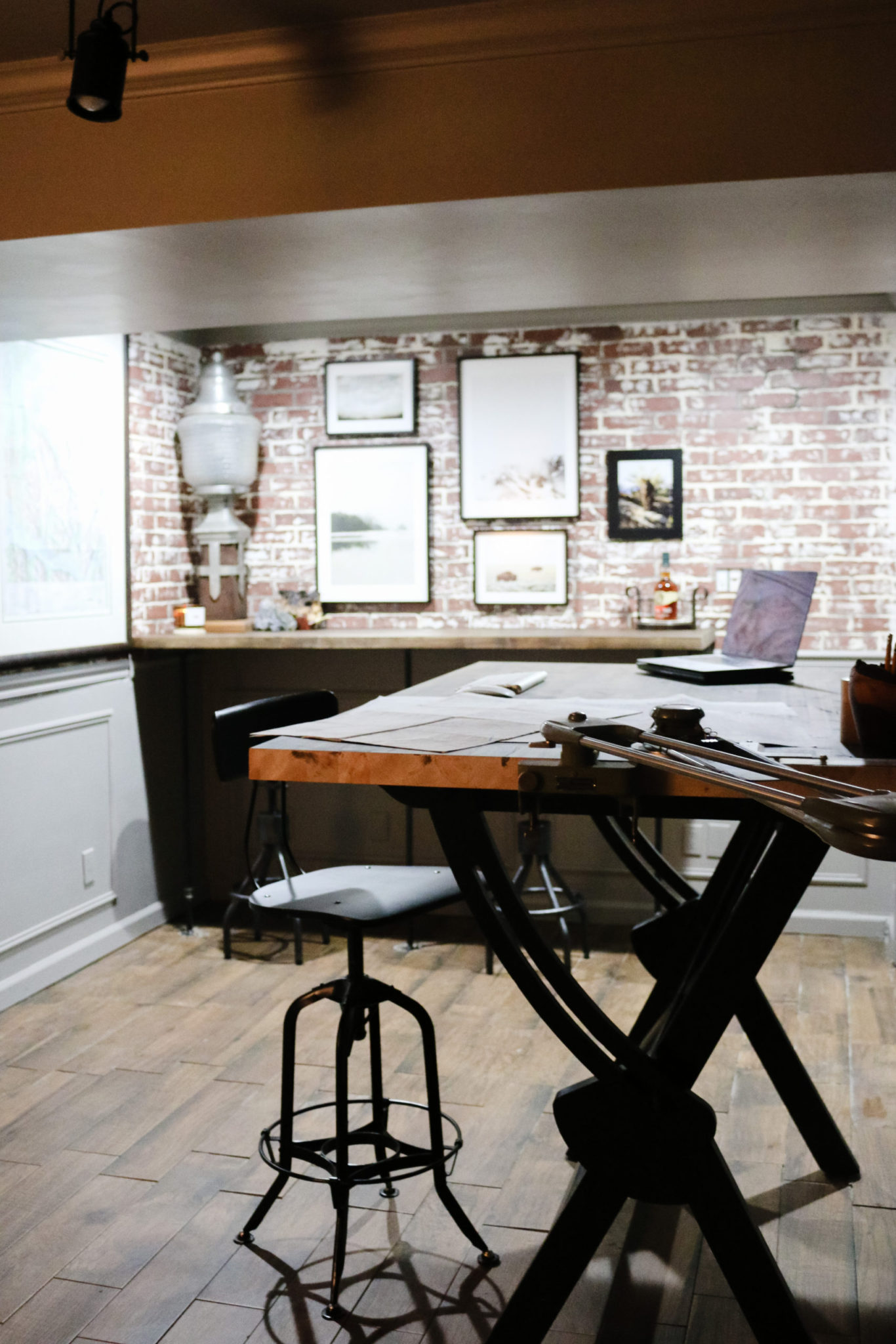
The look we were going for was antique urban, industrial, and lofty but with little details that made it refined. We used brick panels with a light German smear finish (blog post coming soon) to give the antique and worn look, picture framing trim, chair rail, and crown molding to give the refined quality, and the tile flooring [since it’s a basement] to look like old school hardwood rough-cut flooring. Here is a quick reminder of what it looked like before:

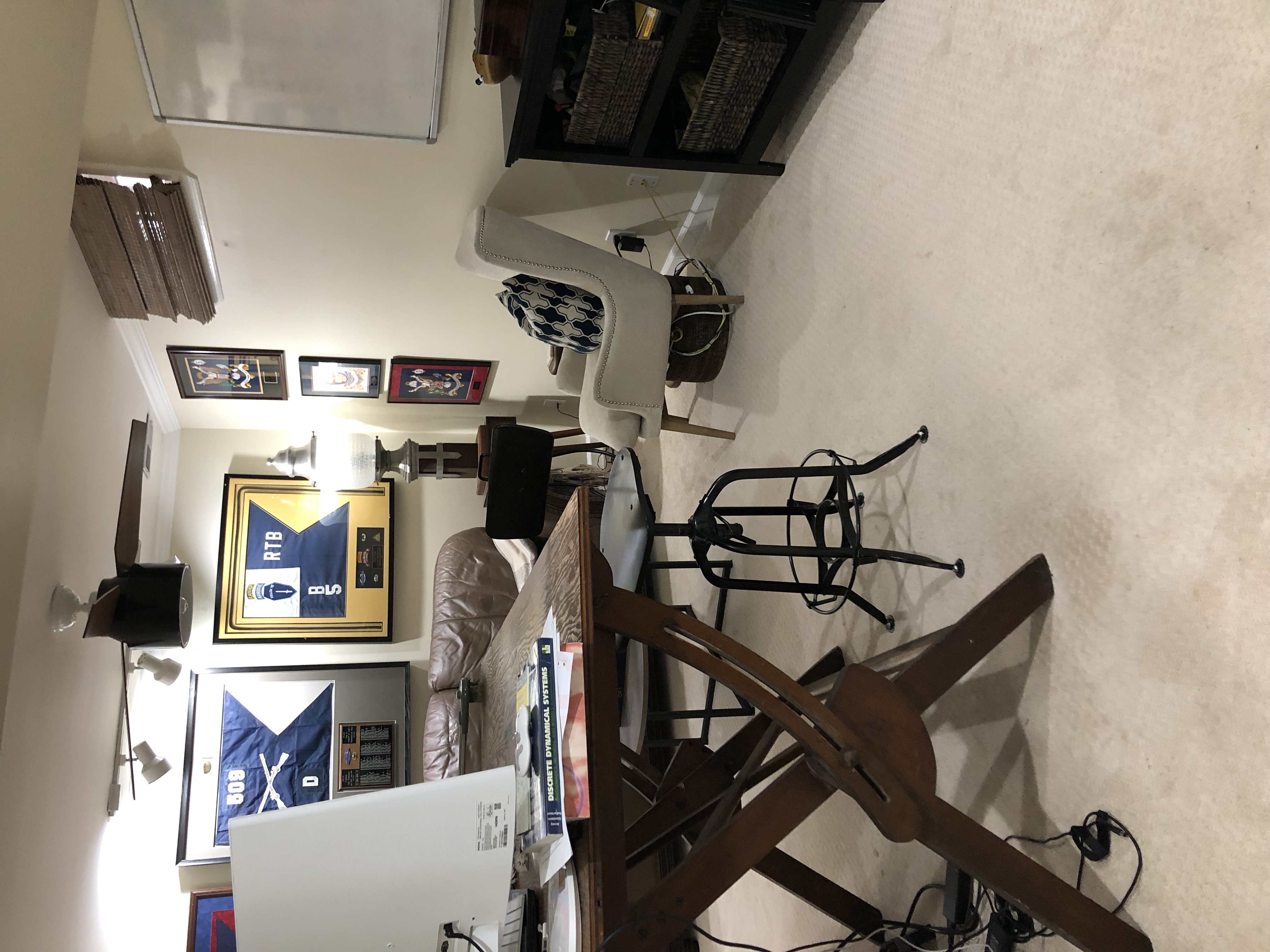
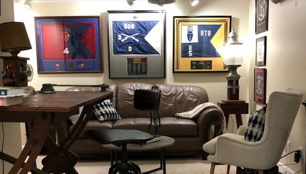
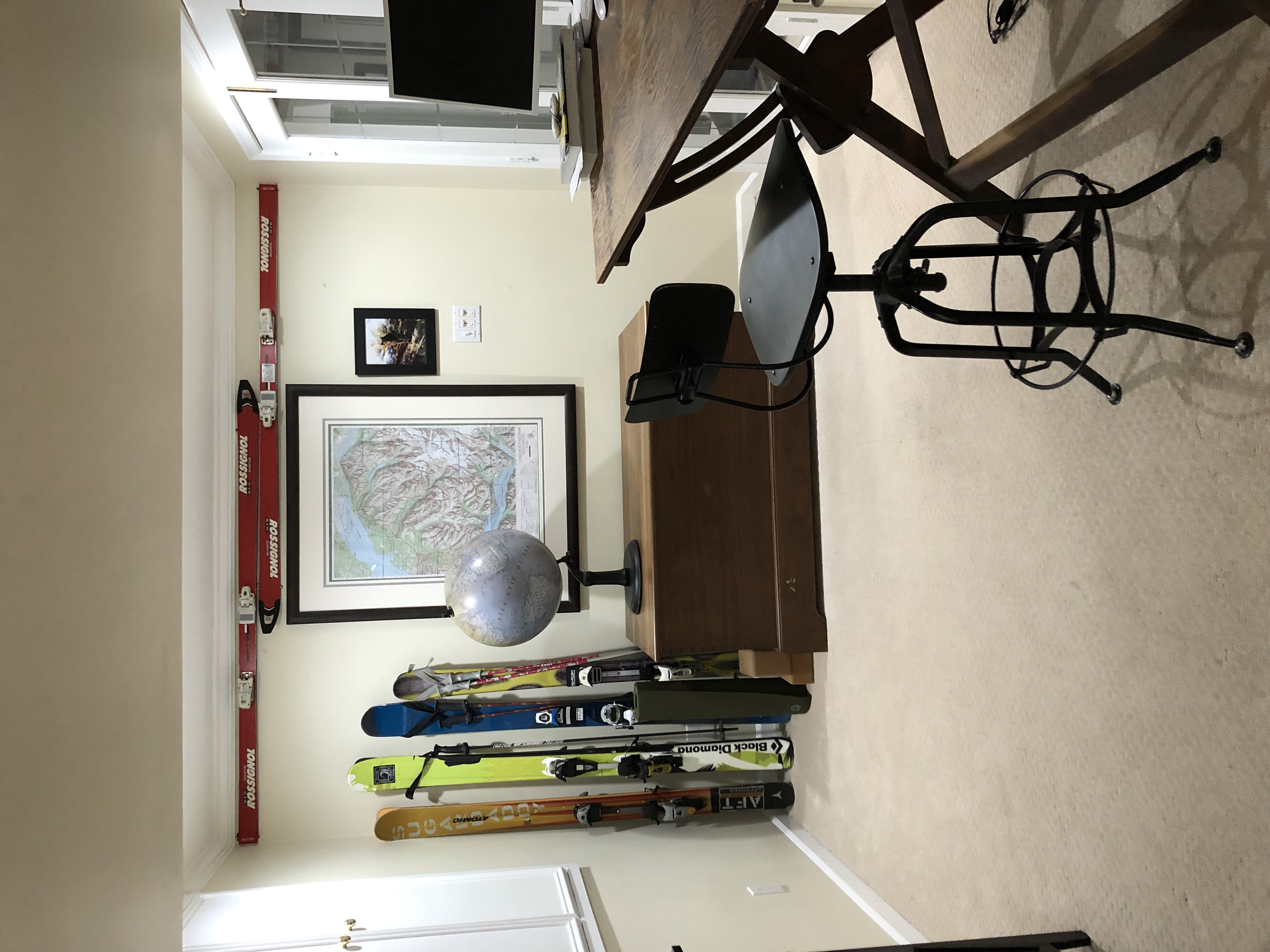
As you can see, the original color was neutral but lacked charm or personality. The room was cluttered with personal effects. I always consider replacing carpeting a success and there was 1980’s track lighting that desparately needed replacing!

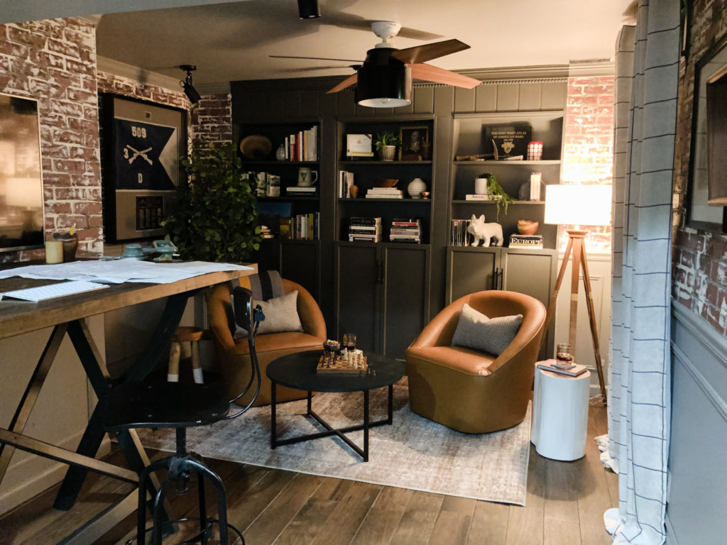
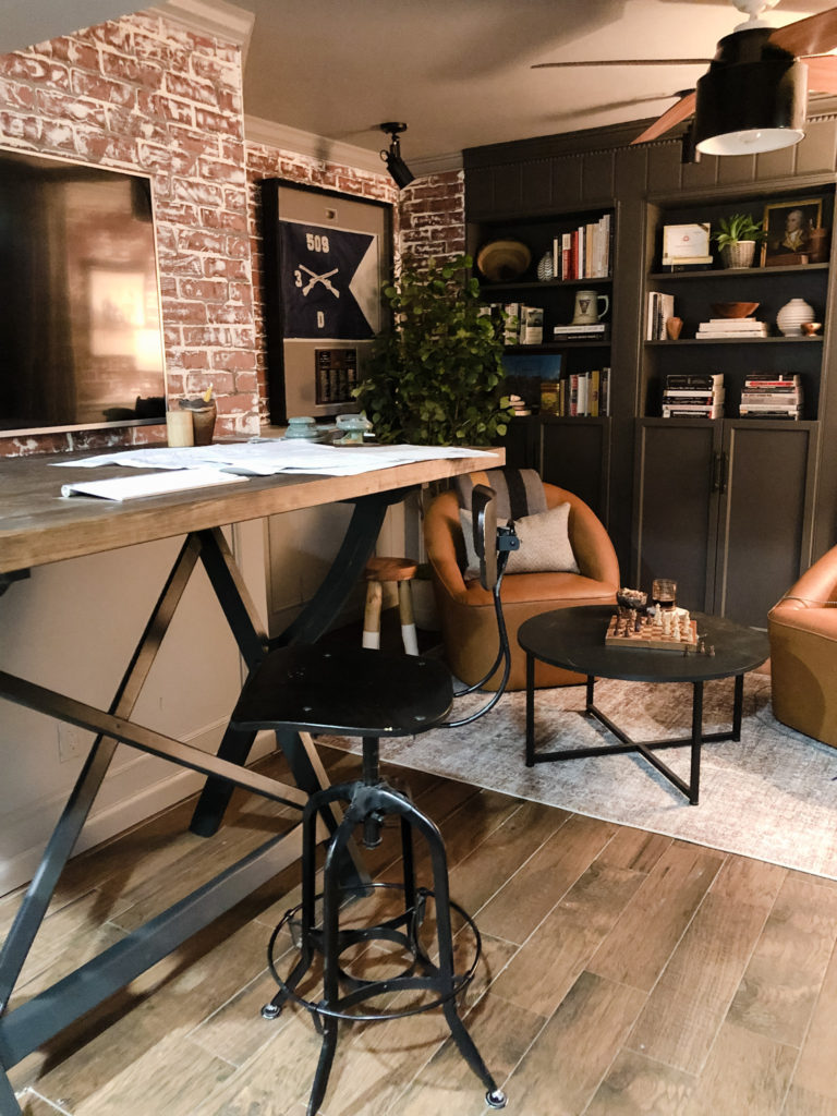
We always loved this drafting table’s antique and industrial look, so we wanted to incorporate it into the space. It was originally a stained base with a stained piece of plywood for a top. Since it was a gift from a dear friend with a considerable amount of sentimental value, we decided to give it a color upgrade and a new, larger top. We refinished it by painting the bottom Green Black by Sherwin Williams and then added the butcher block top with a dark stain. Same great look, now more consistent with the improved room.
Adding a large flat panel TV for a monitor provides a touch of modern and allows Joe to use multiple screens and windows to do his work. This room is such a unique addition to our home that it may also work well for big game nights and movies!
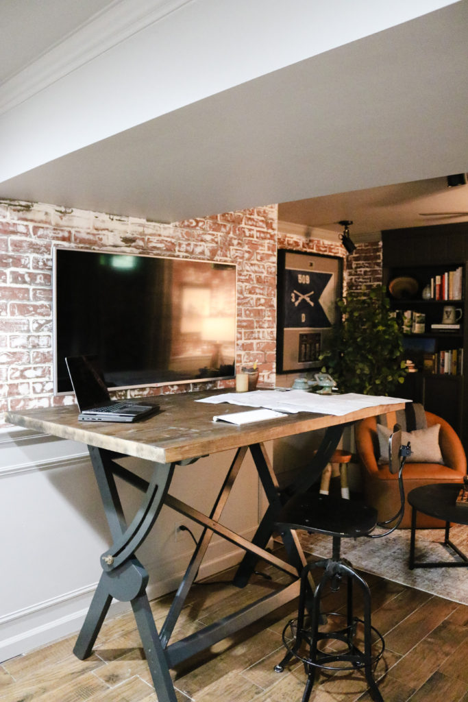
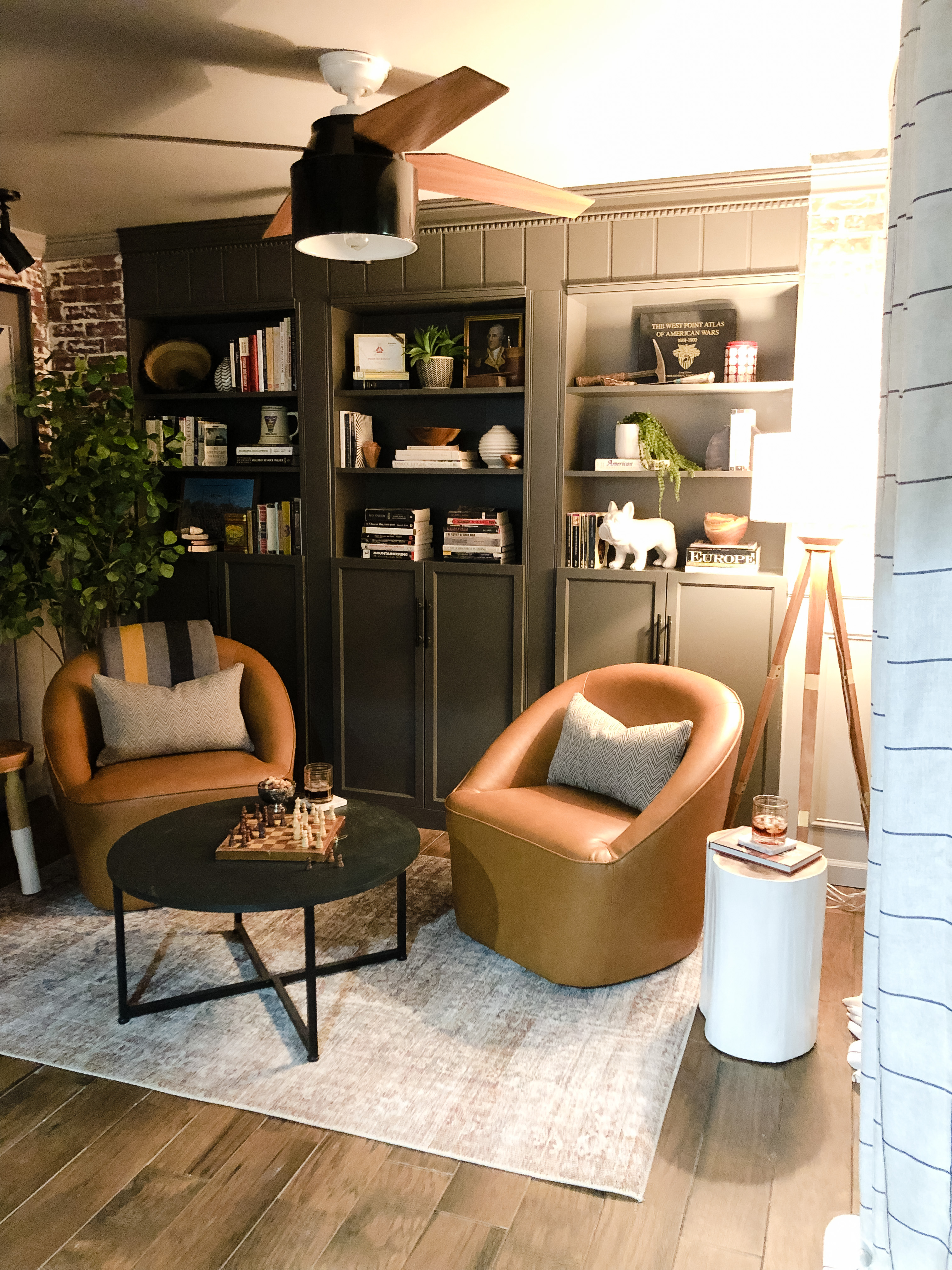
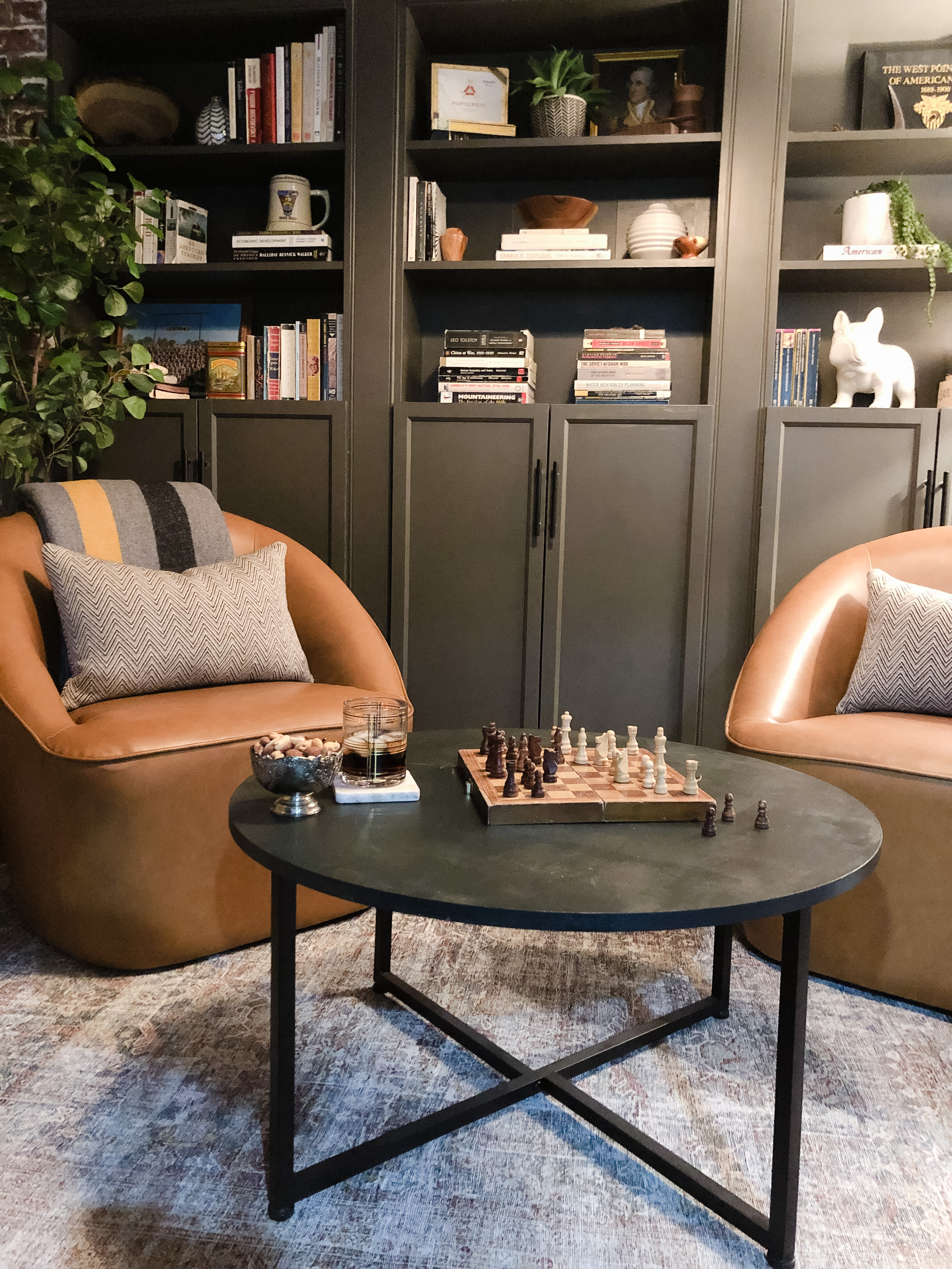
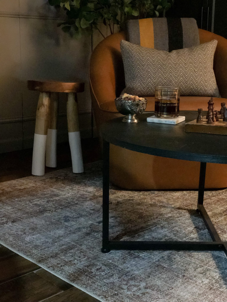
This Chris Loves Julia Brick/Lagoon Rug by loloi is the perfect soft texture this room needed offering a vintage look.
A post will soon be coming on how we built our bookshelves. This is a hack we also used in our media/library room.
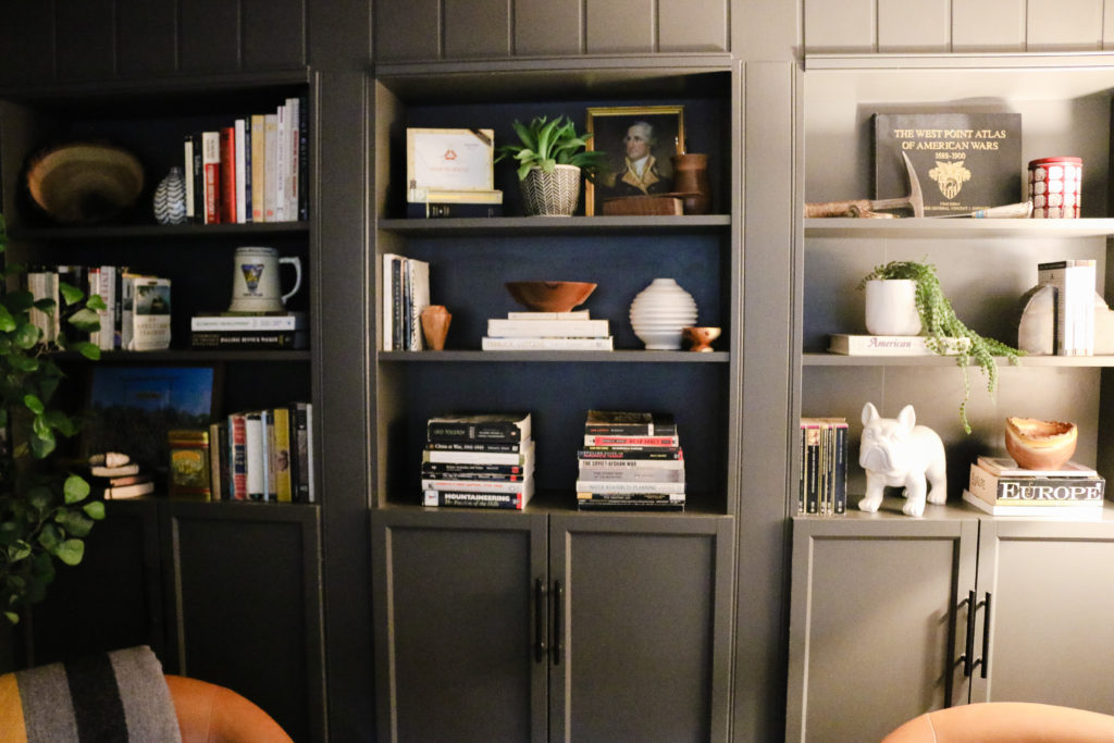
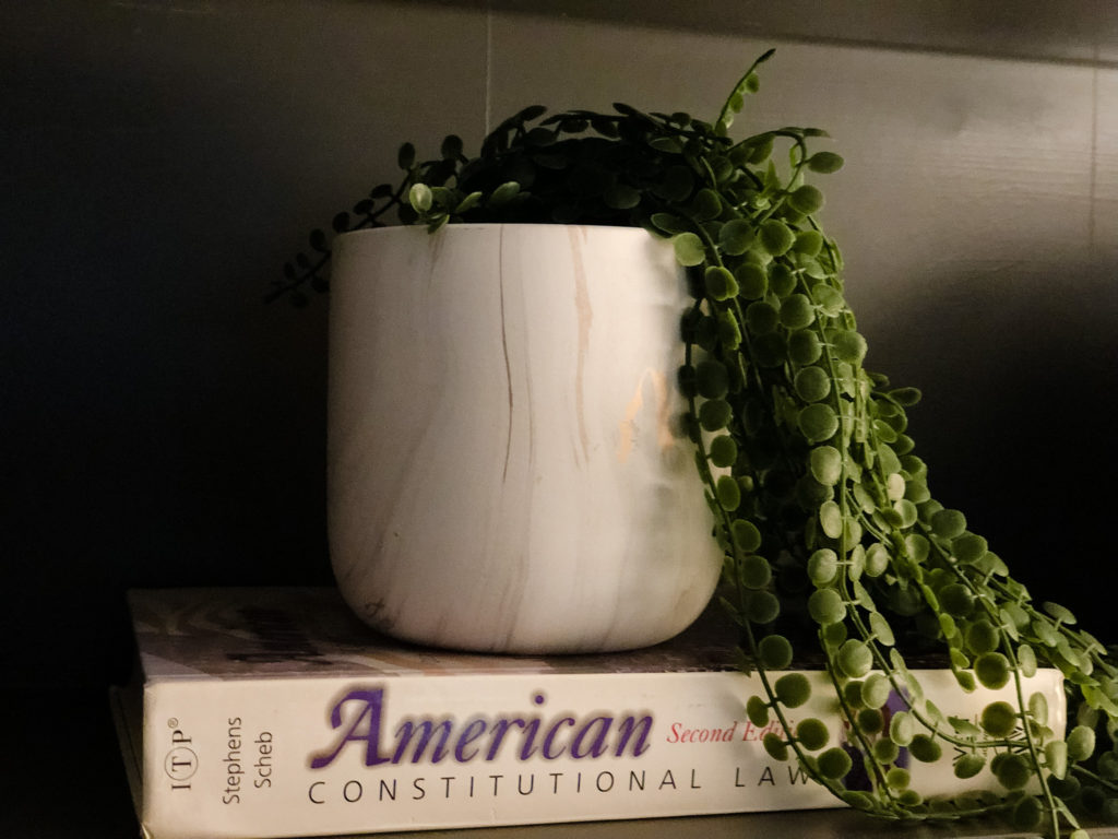
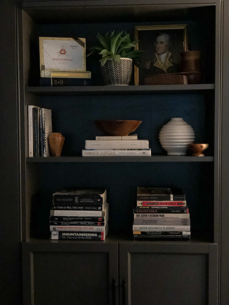
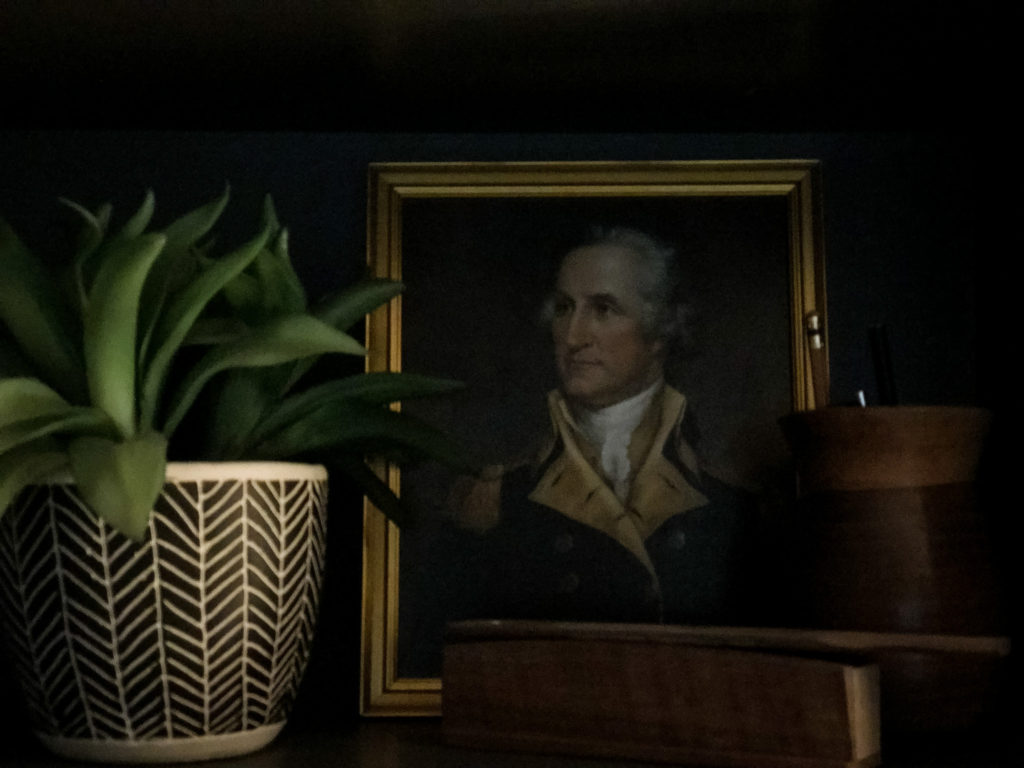
I styled the bookshelves using Joe’s favorite books and memorabilia. Joe joked that he never categorized books by the color of their backing before, but he’s also never had a styled room before! Using items you love and have collected allows the space to have a more personable feel.
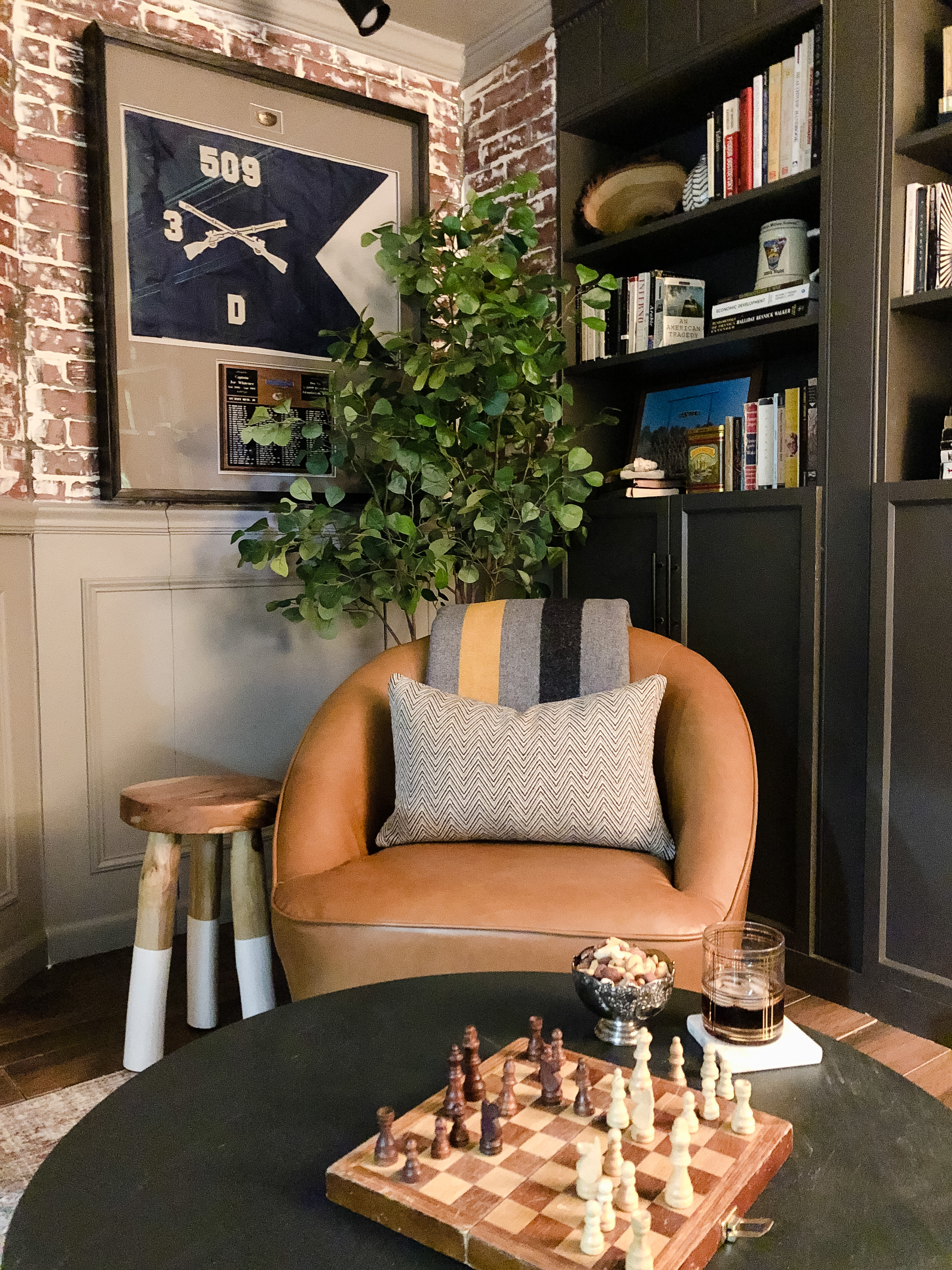
This modern barrel swivel chair by Wovenbyrd is the perfect size and adds a modern touch.
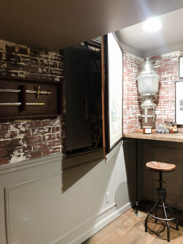
This room is where the circuit panel and internet comes in to the home. The original room had a built in cabinet covering the circuit panel. Rather than keeping the cabinet, we chose to remain consistent with the rest of the wall panels and incorporate a “secret” door to cover the circuit panel, providing a little bit of mystery and more charm to the room.
Horizontal workspaces are important and we wanted consistency in the tops of the desk and the workbench/bar area. Both are the same height and from the same dark-stained butcher block.
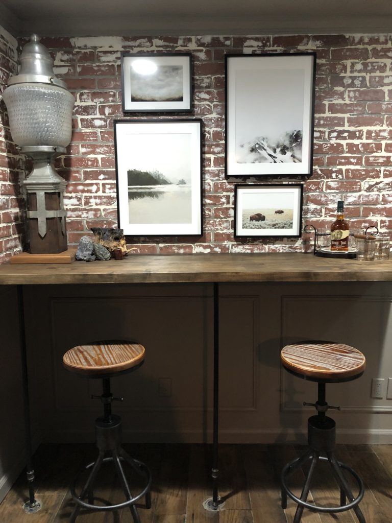
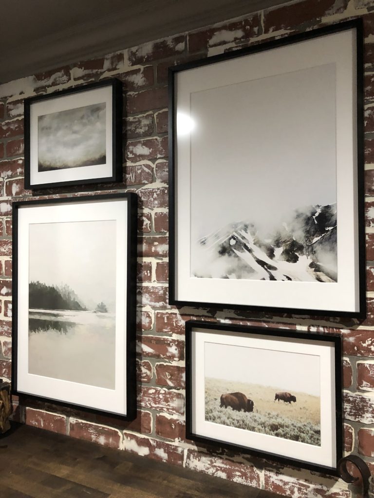
I received all of these beautiful pieces of art from minted. We love to travel out west, and I felt this art pulled Joe’s love for the mountains, wildlife, and big sky.
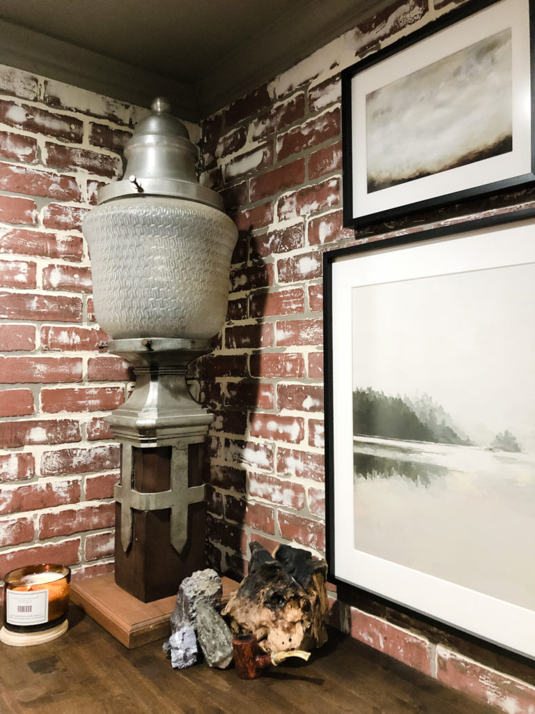
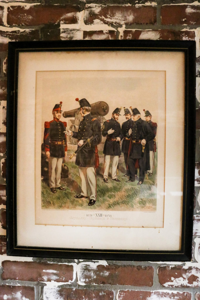
You can tell many of the same pieces made the cut and were incorporated from the old room into the new. Some pieces are just too important to get relegated to the storage area. By thinking through the way they would be used, like this old St. Louis street light, we believe they look even better in the new room. The personal pieces incorporated into the bookshelf decoration blend design and personality, with some of our favorites included in the design mix.
This room was a serious makeover and was a lot of fun designing and building. I hope you enjoy it as much as we do!
Thank you to the following sponsors:

Sources:
Loloi Rug – Chris Loves Julia Brick/Lagoon
Minted pictures – Artists:
Shroud by Heather Deffense
LakeView II Art Print by Amy Hall
Sienna Haze Art Print by Nicole Walsh
Bison Art Print by Kamala Nahas
To save 10% on all minted art, use code MICHELLE10 at checkout.
Paint colors – Urbane Bronze by Sherwin Williams
Floors – Wood look tile (LOWES)
Cabinets – Ikea
floor Lamp –Target
Plant – Target
curtain panels – Amazon
Wrap around curtain rod – Amazon
Bar stools – Amazon
Don’t forget to visit the ORC page to see the other spaces being shared on this challenge. You will find so much creativity, inspiration, and entertainment. Enjoy!


What an amazing transformation! Love the urban antique vibe!
Thank you so much for the kind words Erin! That is exactly the look we were going for in this space.